Wednesday, March 30, 2016

Week 11 Changes and modifications

Changes and Modifications

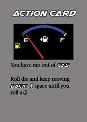
This week, I made numerous changes to the design of the game. I decided to only use 3 categories for my cards. I will have action cards, wild cards, and a super card. A card will be drawn after every turn and it will impact the way the player progresses. If an action card is drawn, the player will either benefit from it or not. If a wild card is drawn, the player may keep the card and use it in case they draw a negative action card. 

EXAMPLES OF ACTION CARDS:


EXAMPLES OF WILD CARDS:


EXAMPLE OF SUPER CARD:


All of the cards were designed in Adobe InDesign. 


Wednesday, March 23, 2016

Week 10 Brainstorming Cards for Gameboard

Process For Designing Cards


This week was dedicated to learning a new tool: Adobe InDesign. We are using InDesign as a platform for creating our cards. The first step to designing the cards was to first find a place that can manufacture them. Luckily, the same place that can manufacture our game boards can make the cards as well (www.boardgamesmaker.com). After determining what size cards I wanted to make, I applied the same dimensions in Adobe InDesign. I will be making 36 cards for the game board. The second step was determining what content and categories will be on the cards. 

The categories for my cards (subject to change) will be: Action cards, Wild Cards, Questions, and Challenges. Action cards are either going to move you ahead or behind on the game board. Wild cards are going to be used as consumable cards in case you pick up an action card that works against you. Questions will be like trivia cards and if you answer it right you will move forward and backward if you do not. Challenges will be physical involving users to interact in different ways. 

Examples of Questions:


Name 4 cars from Chevrolet

What year did Ford redesign the Mustang to resemble the first generation Mustang?


Examples of Action Cards:

Draw a NOS card and you roll a die and move forward the amount rolled

Draw a Flat Tire card and you lose x amount of spaces

Draw a Wrong Turn card and move back x amount of spaces

Wednesday, March 16, 2016

Week 9 Critique of Gameboard


After the critique, I received advice to research "one point perspective". From what I understand, it will aid in lining up my windows on the buildings and bring everything into the right depth. Also, I need to create the bottom piece of the box. The bottom of the box will be the same color as the top, but with another illustration of a burnout mark. The last piece of advice that was given was to make the "Ages" and "Players" more readable on the side of the box. Also, to maybe play around with a white stroke around the title "Race City".

Sunday, March 13, 2016

Week 8 Designing the Gameboard Box


Gameboard Box Ideas


Before we started creating our gameboard boxes, we browsed Google images for the necessities of a box and to spark some ideas. I liked how everything came together in the Teenage Mutant Ninja Turtles box the most. I decided to model most of my gameboard box around this idea, where the main content is in the center of a city. 


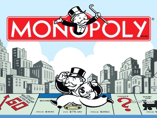
The Monopoly board is classic. I thought about using a design similar to this one and incorporating the actual gameboard in with the box. Also, I like the way the title of the game is large. 


The Risk gameboard box also has the large title and the focal point is in the center. I thought about fading the city buildings and making the focal point the Mustang on my design.


The Big Foot gameboard box, although silly, incorporates people playing the game. This is a great way to show the ages of the targeted players visually. Also, I like how there are pictures on the right side of the box that show how to play the game briefly.


For the Clue gameboard box, I liked how the title was separated from the actual art. I thought about an approach like this, where I can use the different cars (gamepieces) on the box.


The final product. I had to add a jump ramp to make it look like the car was coming "out of the box". I decided to keep the title smaller in order to keep the attention on the car. Everything on the gameboard box besides the car and the title were drawn freehand in Adobe Illustrator.

Friday, February 26, 2016

Week 7 Creating game pieces for the game board

Creating the game pieces

This week I worked on creating game pieces that will be used by the players on the game board. I was originally going to use variations of the same car, but I thought that sounded boring. I searched on Google for side view "photos" of the cars that I chose. After finding the photos, I copied them into Adobe Illustrator where I began to trace the outline of the cars. After making my first game piece, I dragged in ruler guidelines so that each game piece would approximately the same size. On each game piece, the body is one layer and each wheel is separate. When we begin constructing the game pieces, I want the wheels to stand out rather than blend together with the car. Below is what I came up with.


Ford Mustang Gt 5.0


Subaru WRX STI


Dodge Challenger RT


Chevrolet Camaro SS Convertible


Tuesday, February 23, 2016

Week 6 Critique, Adding graphics, and Re-sizing game board


Critique

Last week we critiqued our game boards. I received some suggestions to improve my game board, which I fixed this week. The first suggestion was to fix my yellow lane dividers. The lane dividers are on the game board for cosmetic reasons, to give the board the feeling that you are racing on a street. Some people thought that they were special spaces throughout the board. Second, the rounded edges on each space did not fit in with the racing theme. The spaces resemble "tombstones" and would rather fit in a graveyard theme. Finally, the rules in the bottom right are not clearly visible because of my color tones. 


Adding Graphics and Re-Sizing

After hearing the feedback from last week, I corrected my problems starting with the "tombstone-like" spaces. I decided to just make the spaces "rectangular" as it looks more like a street would. For the lane dividers, I learned a new technique in Adobe Illustrator with the line tool. I started on space 1 and followed the center line, counter-clockwise, around the board to space 62. At first, it appears as just one continuous line. Adjusting the stroke allows you to make the line "dashed" and adjust the amount of "gap" between the line. Last, I decided to remove the box/border around the rules and adjust the color tone so you can clearly read the rules.

Next, I started adding graphics to the board to go along with the rules. I also re-sized the car so that it is more of a focal point on the game board. I decided to move the title of the game to the top of the board and add a flag on each side. After placing the graphics and re-sizing some of them, I had to re-size the game board to industry standards of 18" x 18". The border/box around the game board is used for containing the board within 1/8" on each side to allow for bleeding from printing.  

Wednesday, February 10, 2016

Week 5 Adding Theme and Illustrations to the Gameboard Project

Adding Illustrations

I spent some time thinking about the concept of my board game this week and came up with four illustrations that tie into the game. 


The Mustang

The Ford Mustang is one of my "dream" cars to own after graduation, so I decided to centralize the theme around it. To craft it, I found a photo online and used it as a stencil to trace it. Then, I started customizing the colors of the car. I decided to use these colors because it's almost exactly how I want my dream car to look. At first, the windshield was a solid gray color. I wanted to add a reflection off of it, so I changed it to a gradient fill. As you can see in the image, the windshield starts with a "white" and slowly fades across, gradually getting darker.

I made sure to be organized throughout the process, so I used multiple sub-layers. By doing this, I am able to change the color of any of the parts on the car. For example, if I want the body color to be white, I select the sub-layer and change the color. All the other layers will not be affected. Let's say I wanted to change the stripe to be "blue". The same concept applies.


Finish Line Flag

The flag is placed at the center of the board, to attract the user's eye to the finish line, where you win the game. Initially, I started with an outline of the flag. Once the outline was completed, I started working on the white checkers. Each white checker is a separate layer placed onto a single black layer. By crafting it this way, I avoided having to draw each and every checker piece on the flag. Also, I can easily change the color of the white squares because they are in their own sub-layer. For the colors, I just went with the traditional racing flag colors. Didn't have to give much thought to that.


NOS 

The idea behind the NOS is that when you land on a space containing the NOS image, you get to move forward +3 spaces.

As you can see, I made use of the gradient fill again. Twice! The bottle was initially a solid blue, but I didn't like how "plain" it looked. I wanted to give the bottle a reflective shine. The fitting coming from the bottle to the valve also has a gradient fill. Again, I chose to use the traditional colors that compose a bottle of NOS.


Police Lights

If you land on a space containing the police lights image, you will lose your next turn.

I came up with this drawing rather quickly. I drew one light and then mirrored it. After that, I drew the siren in the center. Initially, one light was blue and the other red. Then, I wanted to add the effect that the lights were engaged. It may not be perfect, but I used my favorite tool: gradient fill.


Rough/Final Look

This is close to the final look and feel of the gameboard. I already have a few changes in mind. I want to put the directions above the car and make them larger. This will give me room to enlarge the title and add some graphics around it. Also, I want to make a pile of cash illustration to add to the theme of winning the race. I am thinking about placing it on the right side of the finish line flag.